Instagram Reels Cover Photo Tips for Cohesive Thumbnails

Reels Cover Photos That Look Cohesive, Clickable, and On-Brand
A Reel cover photo is more than a frame—it’s the first promise made to a viewer on the Reels tab, profile grid, and Explore surfaces. A strong cover system improves clarity at a glance, reinforces brand recognition, and keeps the profile looking consistent even when individual videos vary in style. Use the guidance below to choose the right frame, design readable text overlays, and build a repeatable checklist for every Reel.
What a Reel cover needs to do in under a second
Your cover is competing with dozens of other thumbnails at once. The goal isn’t to say everything—it’s to communicate the right thing fast, so the click feels obvious.
- Explain the value instantly: show the topic plus the outcome (what the viewer gets).
- Stay legible at small sizes: especially on the profile grid preview where details disappear.
- Look consistent across a series: the feed should read like a collection, not random posts.
- Support the video’s hook: reinforce the idea without repeating the first line word-for-word.
- Match expectations: the cover should accurately represent what the Reel delivers.
Sizing, safe zones, and where covers get cropped
Reel covers get scaled and cropped in different placements. Design for the main Reels view first, then confirm it still works as a tiny square on your profile grid. When in doubt, keep the “meaning” of the cover in the center: subject + headline + any small brand element.
- Design for the main Reels view first, then verify how it appears on the profile grid.
- Keep important text and faces away from edges to prevent cropping on different surfaces.
- Use high-contrast elements that remain readable even when the cover is reduced to a thumbnail.
- Avoid placing key text near the bottom where interface elements may overlap.
- Export at high resolution and test on multiple devices before publishing.
Quick placement checklist for reliable visibility
| Area | What to keep here | What to avoid |
|---|---|---|
| Center focus zone | Main subject, headline words, brand mark if used | Busy patterns behind text |
| Top and side edges | Background-only space | Faces, logos, and small text |
| Lower third | Optional supporting detail (short and bold) | Critical instructions, tiny captions, thin fonts |
| Grid-preview mindset | Large headline and clear subject silhouette | Long sentences and multiple small badges |
Choosing the best frame: a repeatable method
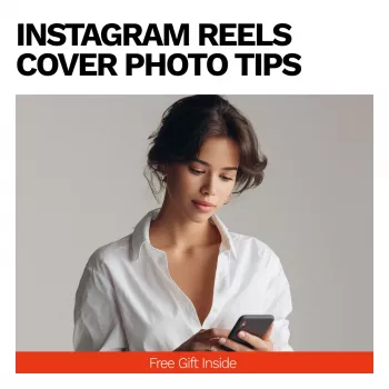
If you’re using a video frame as your cover, treat it like casting a movie poster. A single frozen moment must read as intentional—even if the Reel is fast, handheld, or shot in mixed lighting.
- Scrub for a frame with clear emotion or action: eye contact, gesture, product-in-hand, or a strong before/after moment.
- Prefer frames with a simple background or strong separation between subject and background.
- Check for motion blur and awkward mouth shapes; covers freeze impressions.
- If the Reel is educational, choose a frame that visually signals the topic (tool, screen, prop, result).
- When the best frame is still weak, use a dedicated cover graphic instead of forcing a video frame.
Text overlays that stay readable on every screen
Text overlays work best when they behave like a label: short, bold, and organized. If the words need more room, that’s usually a sign the cover is trying to do the caption’s job.
- Keep the headline to 3–6 words; treat it like a label, not a caption.
- Use one font family and two weights (for example, bold + regular) for a clean hierarchy.
- Increase contrast with solid color blocks, subtle gradients, or a shadow/outline—avoid low-contrast text on detailed frames.
- Prioritize the first 2–3 words; that’s what most people read at thumbnail size.
- Use consistent placement across a series (same corner, same alignment) to build recognition.
For accessibility-minded design, contrast matters—especially for small thumbnails and bright outdoor viewing. WCAG guidance on minimum contrast is a helpful benchmark even for social graphics: WCAG 2.2 Understanding Contrast (Minimum).
Building a recognizable cover style for creators and businesses
A cohesive Reel grid doesn’t require identical covers. It requires a repeatable system: consistent color, consistent typography, and a predictable layout that your audience learns to recognize.
If you’re aligning covers with a broader content plan, it helps to standardize who chooses the frame, who writes the headline, and who checks grid cropping. Official platform documentation can clarify what’s possible (and what changes over time): Instagram Help Center and Meta Business Help Center.
A pre-publish thumbnail checklist
Helpful tools and a ready-made guide
- Instagram Reels Cover Photo Tips | Instagram Reel Cover Guide, Reels Thumbnail Checklist, Social Media Branding eBook for Creators & Businesses
- Rate Right | Freelance Pricing Checklist with ai for setting freelance rates, Confident Rates, Smart Pricing Strategy
FAQ
Should a Reel cover be a video frame or a custom graphic?
Use a video frame when the subject is clear, well-lit, and emotionally compelling. Use a custom graphic when the frame is cluttered, you need prominent text, or you want a consistent layout across a series.
How much text is too much on a Reel cover?
Aim for a short headline of roughly 3–6 words. If it takes a full sentence to explain, the cover will likely be unreadable on the grid and should be simplified.
Why does my cover look fine in editing but awkward on my profile grid?
Different placements crop and scale covers differently, so what looks centered in editing may shift on the grid. Keep key elements in a central safe zone and preview the grid view before publishing.


Leave a comment